Whether we’d like to accept it or not autumn (or fall for all our readers from the USA) is upon us.
Yes, it’s time to pack away our BBQ’s, fold away the neon bikinis and find another use for all of that Glastonbury glitter until next year.
As the temperature drops it becomes less easy to leave the cosy comforts of our beds, if you aren’t indulging in a sun-soaked holiday and are defiantly refusing to crank the central heating up to the highest for now; giving the spaces in your home a new coat of paint could offer you the seasonal warmth you are looking for.
If you are excited about the chilly transition, iconic paint brand Farrow & Ball have just announced nine gorgeous colours to replace existing ones, the first new colour launch since 2016 so a rather exciting time for everyone passionate about their craftsmanship. The autumnal appropriate colour palette ranges from soft whites and leafy greens to deeply rich reds, continue reading to see all nine new interior colours.
SCHOOL HOUSE WHITE – Nº 291
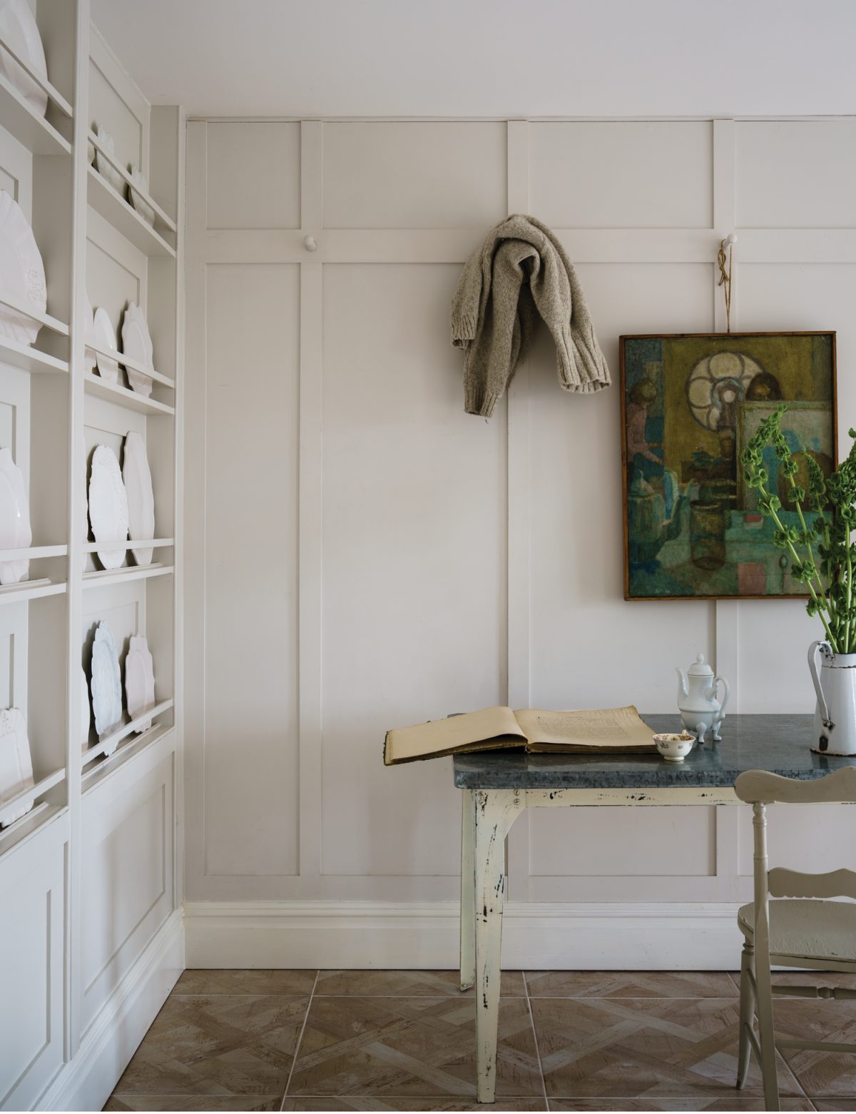
Reminiscent of the colour used to paint old school houses, this soft white although cool in colour could really warm up a room with the right accessories. Add a bit of texture to your chosen room with monochromatic rugs, like our Romo Nahli Rug. Instead of flowers replace them with candles, we have an amazing range of True Grace candles and would suggest ‘Amber’ due to its citrusy and wooden notes; bound to give your home the authentic autumnal feel. A particularly nice white to break away from traditional cream tones and to stay even further away from clinically ‘hospital’ white.
JITNEY – Nº 293
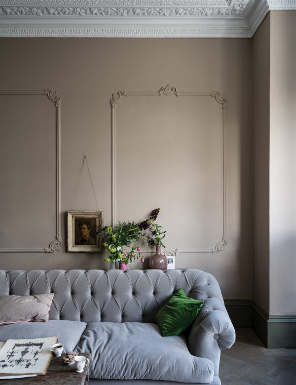
A lovely sandy tone, the colour’s name was inspired by the bus that takes New-Yorkers from the city to beaches in the Hamptons. The colour is quite interesting as it’s hard to pinpoint exactly what colour it is – is it dusky pink? Is it brown with beige undertones? You decide. This colour on its own already has an autumnal appropriate feel, bring the colour alive even more with gold accessories like our Chanel Console Table the concrete table top will provide a complimentary contrast, sure to give your home the autumn seal of approval.
PAEAN BLACK – Nº 294
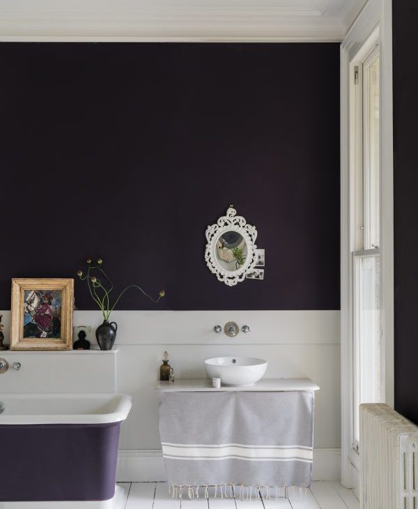
A Georgian inspired red based black and one of my personal favourites. As someone who really likes the colour black but could never justify painting the rooms in my home black, this colour allows a happy medium without looking like you’re decorating for the Adam’s family. This daring colour is sure to warm up the rooms in your home; we’d recommend you dare to be bold and paint an entire room in this shade, using light coloured furnishings to provide a soft contrast.
PREFERENCE RED – Nº297
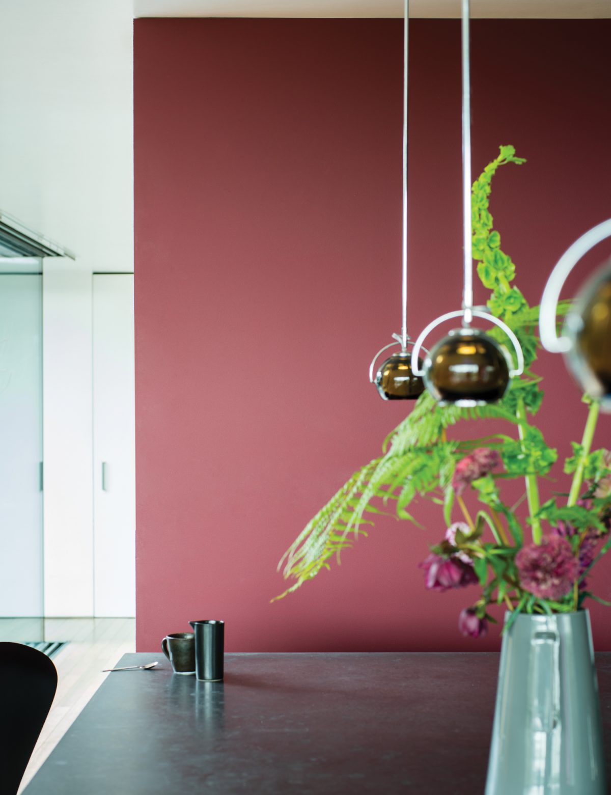
Another personal favourite of mine, as it reminds me of my go to date night lipstick – Expérimenté by Chanel. It’s seductive and sultry without being too provocative; it’s also the richest red of Farrow & Ball’s current palette. This red would look perfect in a modern living room, especially against a wall with a fireplace, toasty. This colour does exude a lot of warmth on its own so to lighten things up a bit go light and monochromatic with accessories like this one from our Kirkby x Eley Kishimoto range.
RANGWALI – Nº296
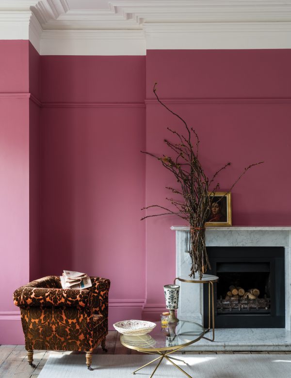
A lovely inviting pink, the name inspired by the powder used at the Holy festival of colours in India. This kind of pink doesn’t scream little girl’s bedroom which is what I think is most lovely about it. Pink has a way of invoking a juvenile feel but this is the perfect colour for an adult bedroom or study space, to open up the room a little more add some artificial plants to the room like our Tall Monstera Plant.
SULKING ROOM PINK – Nº 295
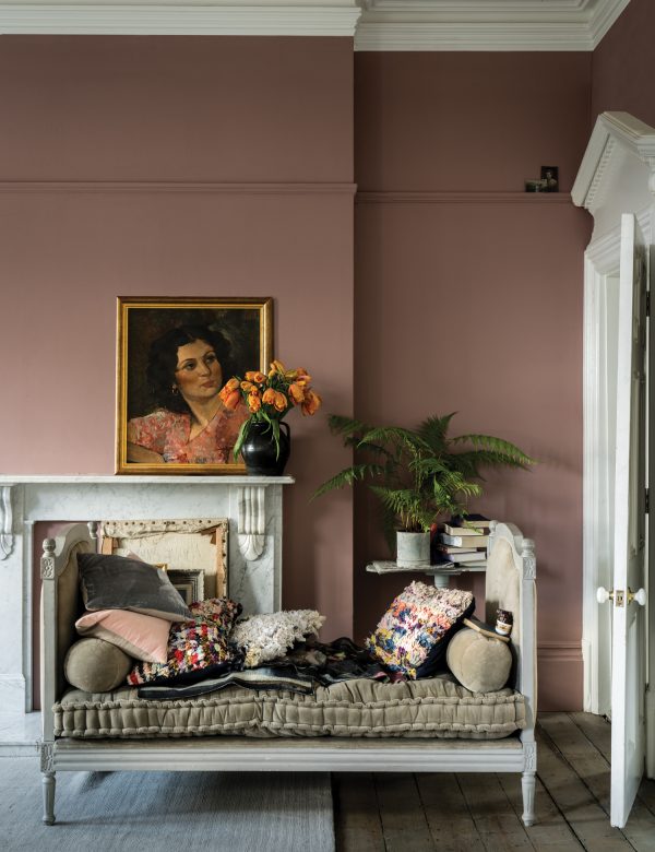
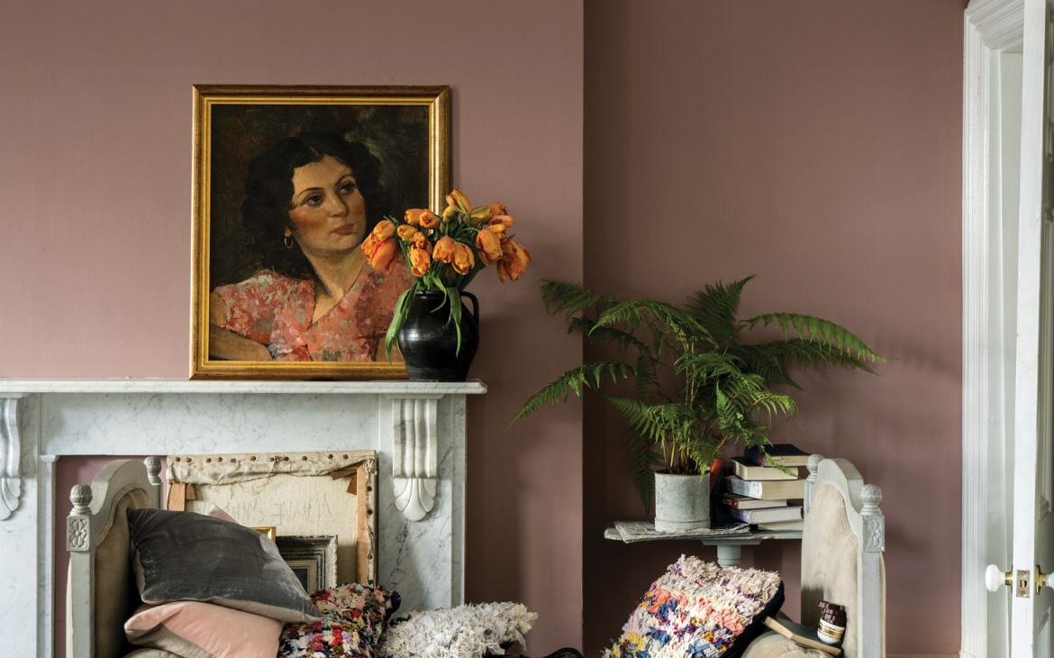
A muted rose tone is evocative of the colours used in boudoirs. If you’re using this in your beauty room, make the pink pop by decorating the room with light and airy furniture like our Scandi Chic Sheepskin Rug – which is available to come and feel in our showroom! What I love most about this shade of pink is that it’s almost as if a rose were iron pressed and then hung out to dry. A very retro dusky feel for interiors!
BANCHA – Nº 298
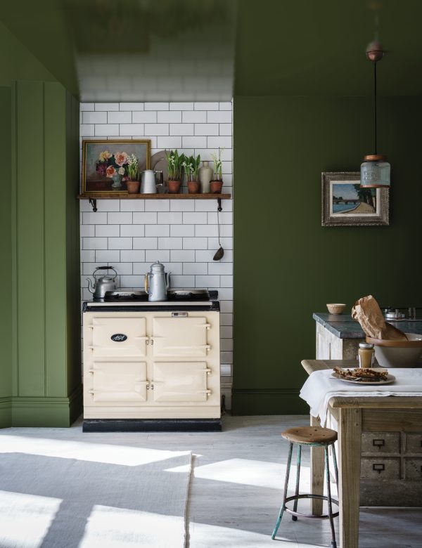
Named after Japanese tea leaves, this leafy green provides a feeling of calm and security. Bancha has an organic autumnal feel to it already, so doesn’t need too much decoration. Pair with dark wood like Mahogany or Mango wood and watch the colour come alive, this shade of green feels very homely and could very easily be adapted for when summer rolls back around with light and earthy botanical prints.
TRERON – Nº292
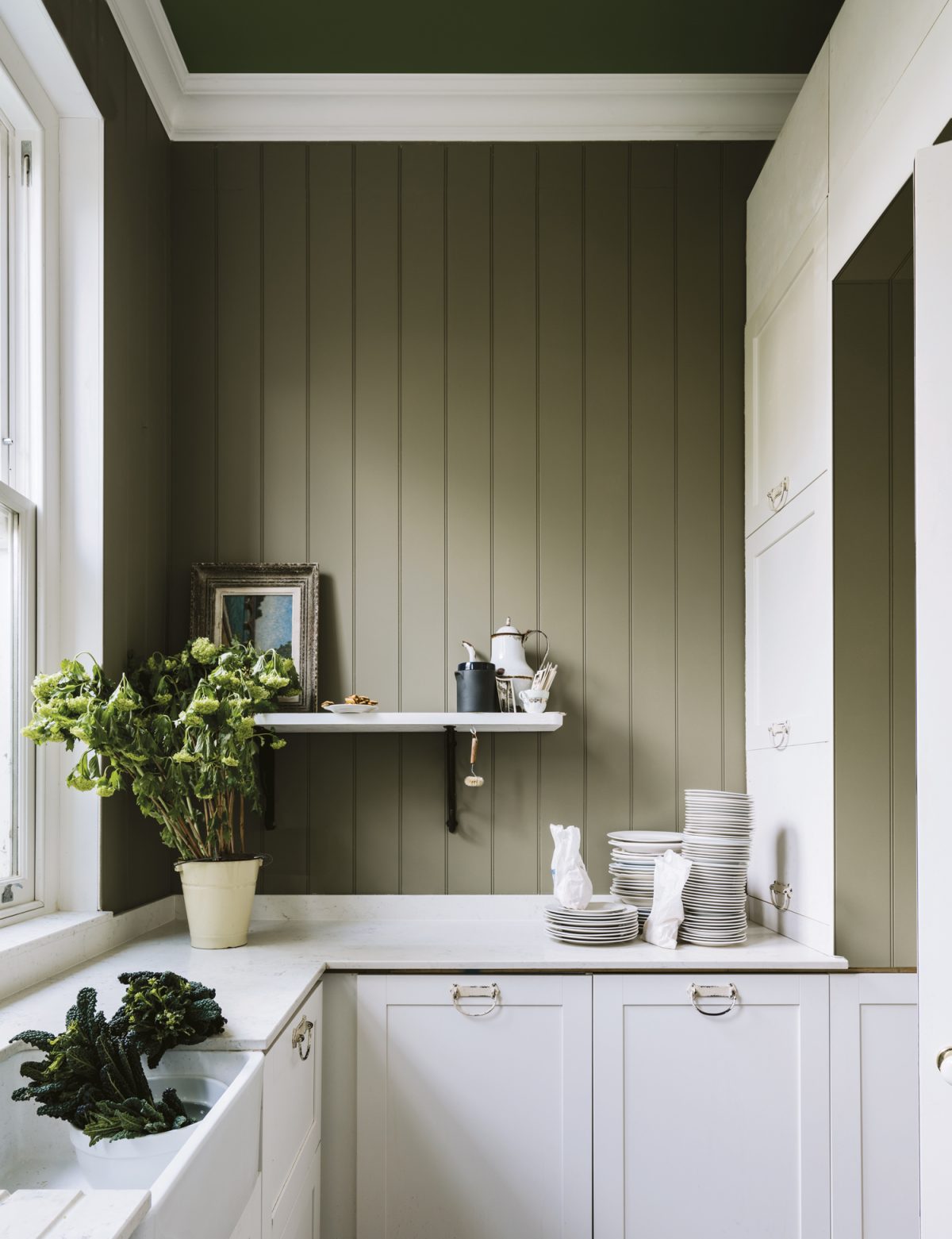
A grey-green tone, this colour does have a cooling aspect to it. Because of the grey undertone to this colour it will match perfectly with any Scandi inspired interior. If you aren’t the biggest fan of green but love grey this could be the colour for you. Grey is becoming a little overused as of recent, so this unique colour is one way to keep on trend without looking too similar to everyone else. To warm it up a little bit our suggestion would be to add texture to whatever room you choose this colour for, with some chunky throws like our Cougar Shadow Mountain Faux Fur Throw.
DE NIMES – Nº 299
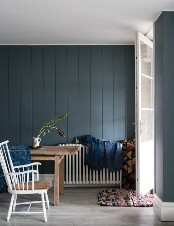
This elegant colour is inspired by the cloth of everyday work wear originally made in the French city of the same name. This colour would look lovely in a modern kitchen; use the colour with white tiling to bring some light back into the room. This colour is really interesting because depending on the light in your home it could pass as a steely blue, but could very easily be utilised as a grey tone as well. Paired with some natural wood furniture in a well-lit room, the colour could vary throughout the day.



Comments are closed.