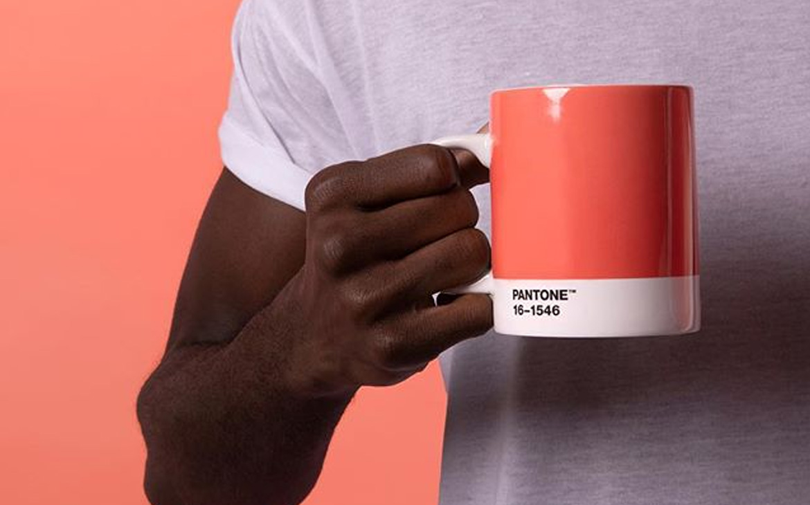
It’s the most wonderful time of the year! We know Christmas is rapidly creeping up to us and excited we are (promise). Before we become too consumed by holiday cheer; another, equally as wonderful time of year is already here, especially for interior enthusiasts. On Thursday morning, Pantone announced its Colour of the Year for 2019, it’s striking, it’s vibrant – it’s Living Coral (16-1546 TXC).
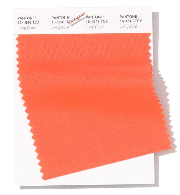
For twenty years, Pantone has selected a colour of the year through rigorous consideration and extensive analysis. The final decision is hugely important and influences trends across a variety of industries including interiors and fashion; and if we do say so ourselves, this is a tone we are more than happy to be enamoured by.

Inspired massively by the vibrant tones found in our coral reefs, Pantone summed up how they came to their colourful conclusion beautifully:
“In reaction to the onslaught of digital technology and social media increasingly embedding into daily life, we are seeking authentic and immersive experiences that enable connection and intimacy. Sociable and spirited, the engaging nature of PANTONE 16-1546 Living Coral welcomes and encourages light-hearted activity. Symbolizing our innate need for optimism and joyful pursuits, PANTONE 16-1546 Living Coral embodies our desire for playful expression.
Representing the fusion of modern life, PANTONE Living Coral is a nurturing colour that appears in our natural surroundings and at the same time, displays a lively presence within social media”.
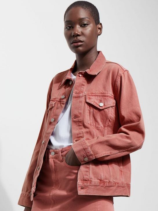
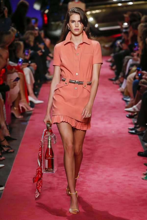
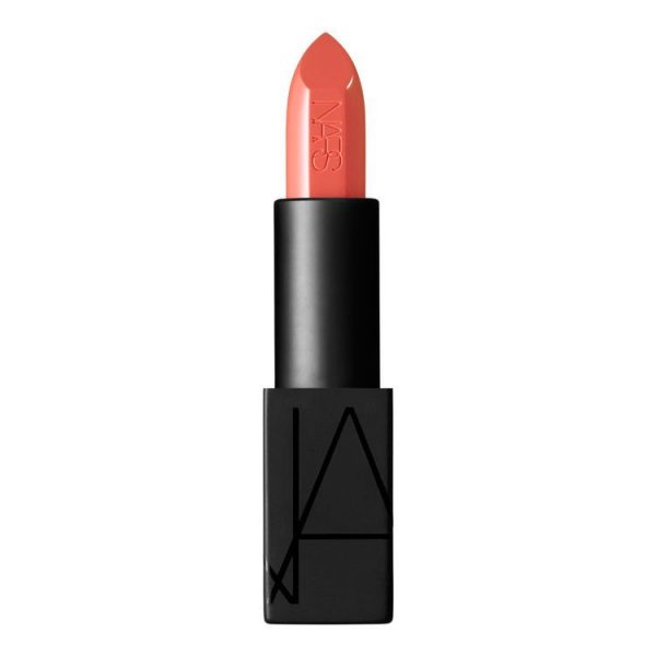
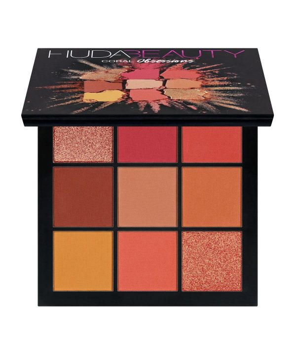
We can look forward to seeing coral hues now, as the announcement is bound to have designers of all disciplines utilising the colour more often. Fashion designers have already started paving the way, with many designs for AW18 from the likes of Calvin Klein and Moschino being coral inspired. Make-up guru Huda Kattan recently launched her own ‘Coral Obsession’ eyeshadow palette, whilst cosmetics brand NARS also have a near identical lipstick shade.
Aside from it being a beautiful and vivid colour; Living coral is one of those tones that will accentuate any room and flatter all skin types. It’s here to stay at least for the next year; so rather than just getting used to it, let’s embrace it!
Pictures from: Pinterest, Pantone, Vogue.com, Sweetpea & Willow, Cultbeauty – (Huda Beauty), Bloglovin – (My unfinished home)
